Creating Cross Browser Compatible CSS Text Shadows
Posted by Neil Crosby on February 22, 2005 12:00 PM
Way back at the beginning of september, I was having a discussion with one
of my friends about drop shadows in CSS. Currently, the only web browser
which supports the CSS2 text-shadow property is Safari,
which does the job really rather nicely. At the time, I made the statement
that you could get pretty much every other browser to create nice text
shadows as well, without having to add lots of extra markup to your HTML.
So, the challenge was simple. Come up with some CSS which will produce drop shadows in as large a percentage of peoples’ web browsers as possible, leaving the browsers which are incapable of showing text shadows with unstyled text. Sounds simple? Well, for the most part, it was…
There are already tutorials out on the web which tell you how to produce
text-shadows for various web browsers. The problem is, they all seem
to focus on one particular browser, rather than producing a cross browser
compatible solution. Of course, the “one true solution” is to wait until
everything supports the CSS2 text-shadow property, but that
day won’t come for a good while yet. So, in the mean time, here’s how
I put everything together into one package so that it all “just works”.
Start with a Safari
In a big break from tradition, I decided to start by writing the CSS
Apple’s Safari web browser. But why would I do this?
Although I generally start work on the Mozilla group of
browsers, due to the fact that they have the highest usage of the browsers
which have good CSS implementation, in this instance Safari implements the
text-shadow CSS property staight out of the box. Sadly, at
this time, Mozilla does not - hence the need for this article.
Anyway, the CSS needed for Safari is as follows:
.shadow {
	text-shadow: #666666 5px 5px 5px;
}
If you’re using Safari, this text should have a nice soft shadow
In an ideal world, that’s where this article would stop. Unfortunately, as I said at the top, there’s a bit more of a challenge to go yet. But first, lets do the next easiest bit.
Dropping some shadows with Internet Explorer
Although Internet Explorer doesn’t use the text-shadow CSS property,
it does provide a nice easy way of creating text shadows: the shadow filter. This
is well documented on other sites, so I’ll just give you an example here. To create
similar shadows to the example above for Safari, you’d use the following CSS:
.shadow {
	height: 1em;
	filter: Shadow(Color=#666666,
			Direction=135,
			Strength=5);
}
This text will be shadowed in Internet Explorer.
Mixing IE/Win and Safari
Adding the two techniques together which we’ve used so far is nice and easy. Neither one gets in the others way, since neither one understands what the other means. Consequently, we can just concatenate the two rules to get a shadow in both IE/Win and Safari.
Shadows in Mozilla
Here’s where things start getting meaty. Since the Gecko based browsers do not know about the previous two methods of creating shadows, we need to create our shadows in some third way.
There are various ways that we could create the text shadows in the Gecko browsers.
You could, for example, make use of your favourite image replacement technique to
replace the text to be shadowed with an image of some shadowed text. That’s a
fine technique, but not the one that I chose. What I chose to do was create a
piece of “shadow text” using the :before pseudo-element.
.shadow {
  line-height: 2em;
  white-space: nowrap;

}

.shadow:before {
  display: block;
  margin: 0 0 -2.12em 0.15em;
  padding: 0;
  color: #666666;
}

#shadow_header:before { content: 'In shadow'; }
The code above first sets up the element which is to be shadowed, giving it a line
height of 2em - enough space to position the shadow element behind it. The
element is also set not to wrap, as wrapping would destroy the effectiveness of the
:behind pseudo-element.
As mentioned earlier, the :before pseudo-element is where the meat of
the technique is for the Gecko browsers. The code itself should be pretty
self-explanatory - all it really does is move whatever is written as the
:before content to the right and down a bit, and colours it a light gray.
In order to use the .shadow class multiple times on the same page, and
still use the :before technique, it is necessary to create an extra id
for the element which is to be shadowed. This is the only change
which is made to the html of your page. This addition allows us, as shown above,
to create an extra rule which states the text of the shadow itself.
This example is shadowed in all browsers which understand how to use the
:before pseudo-element.
Hmmm, that’s not very nice
“Just wait one cotton picking minute!”, I can almost hear you cry. “But that gave me a
shadow in Safari too!” Well yes, it would do - Safari knows how to use the
:before pseudo-element. The problem with this is that it means that
you can’t just do a nice easy concatenation to join the three previous rules together.
You can see below what happens when you simply try to join them together.
Admittedly, depending on your eyesight, that doesn’t look too bad in Safari. However,
if you know that both the :before shadow and the text-shadow
shadows are being applied, then you can see them, and the effect does jar. At least,
it does for me. Which is why I started looking for a CSS hack which would allow me to
hide the :before rules from Safari only.
Hiding CSS from Safari
Finding a CSS hack which would allow the hiding of CSS from Safari was not an easy one. I searched on and off for about a week, and could find nothing that worked. Then, as if by magic, Mitchell Stokely posted about the Stokely Safari Hack which he had written on the CSS-D discussion list that I watch. It worked like a charm.
Basically, the Stokely Safari Hack works using a complicated system which first
“narrows the agents focus, then relies on a difference in how IE 6, Safari, and Netscape parse
properties using brackets”. Frankly, it’s all a little complicated, but it works!
Using the following hack, Internet Explorer sees its filter: Shadow method,
Safari only sees the text-shadow CSS property,
whilst Gecko based browsers (and any other browsers which know about :before)
will fall back to the :before text shadow.
Here’s how we do that (no, I’m not going to try and explain how it works):
/* default setup that everything sees */
.shadow {
  /* needed for Internet explorer */
  height: 1em;
  filter: Shadow(Color=#666666,
                 Direction=135,
                 Strength=5);

  /* Needed for Gecko */
  line-height: 2em;
  white-space: nowrap;
}

/*
 * used by browsers which know about
 * :before to create the shadow
 */
.shadow:before {
  display: block;
  margin: 0 0 -2.12em 0.15em;
  padding: 0;
  color: #666666;
}

#shadow_1:before {
  content: 'In shadow';
}
#second_2:before {
  content: 'Happy Shadowing!';
}

/*\*/
html*.shadow {

  [color:red;/* required by Safari
              * so that [] is correctly
              * begun. associated with
              * the property, yet hiding
              * it. Seen by IE6 */

    /*
     * seen by IE6 and Safari, but hidden
     * from Gecko
     */
    text-shadow: #666666 5px 5px 5px;

  ]color:auto; /* resets color for IE6 */
}/**/

/*
 * end hack using dummy attribute selector
 * for IE5 mac
 */
.dummyend[id]{clear: both;}

/*\*/
html*.shadow:before {

  [color:red;/* required by Safari.
                seen by IE6 */

    /*
     * seen by IE6 and Safari, but hidden
     * from Gecko
     */
    display: none;

  ]color:auto; /* resets color for IE6 */
}/**/

/*
 * end hack using dummy attribute selector
 * for IE5 mac
 */
.dummyend[id]{clear: both;}
And here it is working.
In the example above, the html which I used to get the text shadowed across
all browsers was <p class='shadow' id='shadow_1'>In shadow</p>.
Whenever you’re adding shadowed text to your pages using this technique, ensure
that you add a relevant id, and duplicate the text of the shadow into your
style sheet.
And that’s all there is to it. Just in case you don’t have a lot of browsers available to check things in, here’s how it looks to me in a few of mine:
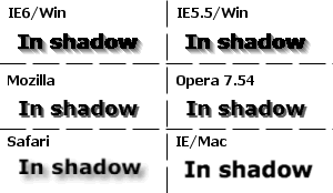
Browser Compatability
This cross browser drop shadows technique has been tested in the following browsers. If you test the technique in any other browsers, please leave a comment here so that it can be added to the list.
-
Safari 1.2.4, 1.3.1 - Displays
text-shadowshadow. -
IE5.5/Win - Displays
filter: Shadowshadow. -
IE6/Win - Displays
filter: Shadowshadow. - IE5/Mac - No shadow. Degrades happily.
-
Mozilla 1.7.3 - Displays
:beforeshadow. -
Firefox 1.0, 1.0.6, 1.0.7, 1.5 Beta 2 - Displays
:beforeshadow. -
Opera 7.54, 8.5 - Displays
:beforeshadow.
Caveat
This hack is just that - a hack - and is only really useful for use right now.
As soon as any browser other than Safari is taught how to use
text-shadow, the hack will have to evolve to allow
that browser to see the text-shadow rule as well.
I hope that someone out there finds this useful. If you find any problems with the technique, or any browsers which do not behave as expected, please tell me!
References
WebThang Text Shadows.
An overview which shows how to use the filter: Shadow Internet Explorer technique.
Text Shadows with CSS.
This page uses the :before technique to create shadows.
The Stokely Hack. Without this hack, there would be no article here today. It’s complicated, but to my knowledge it’s the only current way possible to give CSS to soley the Safari web browser.
If you enjoyed reading this and would like other people to read it as well, please add it to del.icio.us, digg or furl.
If you really enjoyed what you just read, why not buy yourself something from Amazon? You get something nice for yourself, and I get a little bit of commission to pay for servers and the like. Everyone's a winner!
Comments
by Anonymous on March 3, 2005 02:47 AM
None but Safari….
And OmniWeb. I know, it uses the same engine…but, it’s still not Safari… and in some ways miles ahead…. the True first Web browser for MacOS X! I really, would like to see the others catch up… Standards are.. well, standards.
by John on March 24, 2005 12:44 PM
Really cool. Will keep it in mind.
by Anonymous on March 31, 2005 08:29 PM
Nice one :)
by Anonymous on September 25, 2005 07:27 PM
Firefox 1.0.6 doesn’t render correctly
I cut and paste your code and tried displaying it with Firefox 1.0.6. Instead of shadows, I get “In shadowIn shadow” with one “In shadow” being the shadow color, and one being the text color.
by Anonymous on December 5, 2005 08:50 AM
Pretty cool but I was unable to make it work in IE6. I put the code in my external style sheet. And set the style on my page on one line of text AND applied the style to a second line of text lower down on the page. The shadow style worked on the first instance of the text, but the second one it did not. Anyone have an answer for this? Thanks.
by Neil Crosby![[TypeKey Profile Page]](http://www.workingwith.me.uk/nav-commenters.gif) on December 5, 2005 11:45 AM
on December 5, 2005 11:45 AM
I’ve just cut and pasted the code as well and it’s worked as intended for me in Firefox 1.0.6. The closest I got to your predicament was by leaving out the ‘class=”shadow”’ bit, but even that isn’t quite as you describe the issue.
by Anonymous on January 22, 2006 05:50 PM
Hello!
I’ve tried it in KDE Konqueror version 3.5, and yes - since it uses KHTML - the renderer that Safari borrowed from the KDE open source project: www.kde.org / www.konqueror.org - the shadowing for Safari works the exact same way as illustrated in your images at the bottom of the articles. I do also see the merger with the two shadow techniques you say that good vision is needed to be able to notice..
Konqueror is a free web browser available for UNIX operating systems, most commonly used on GNU Linux systems and FreeBSD.. just telling you since you don’t list the browser in the article. Unknown browser, ey? Hope not, it’s really great and usually very fast. ;-P
by Anonymous on February 3, 2006 11:36 AM
But IE’s own shadows are just so ugly!
I’ve had to not use IE’s own shadow filter since they’re just sooo ugly.
by Ian on March 19, 2006 03:12 AM
Hi,
Thank-you for this posting. It was helpful.
I saw that Mozilla has text-shadow listed as “Planned, not yet implemented” here http://developer.mozilla.org/en/docs/User:Biesi
The IE shadow is pretty ugly. If you want to single out Safari and Geko you could do it like this:
I hope this helps.
by Peter Grove on April 29, 2006 10:05 AM
I sometimes use this approach…
html…
css…
by Neil Crosby![[TypeKey Profile Page]](http://www.workingwith.me.uk/nav-commenters.gif) on April 29, 2006 11:49 AM
on April 29, 2006 11:49 AM
Peter Grove: A problem with that approach though is that if the user views the page unstyled then they get the text repeated twice onscreen.
by scott on July 22, 2006 04:44 AM
nice write up - here’s a technique that goes with some of the comments but may be more practical to put into use: http://www.scottjehl.com/jsDropShadows/
by Neil Crosby![[TypeKey Profile Page]](http://www.workingwith.me.uk/nav-commenters.gif) on July 22, 2006 07:22 AM
on July 22, 2006 07:22 AM
Thanks Scott, that looks like a great link.
by Nick Presta on August 21, 2006 06:54 AM
Great article. I like how you got the shadows working for most major browsers.
A while back, I attempted to display shadows in Gecko and I found a way using :after and attr() (I could target only Gecko by using :after).
http://nickpresta.ath.cx/lab/css/dropshadow/
Granted, it looks sort of sloppy in comparison to your example but it worked.
by anonl on September 16, 2006 07:13 PM
For those who are making ugly comments about IE’s ugly shadows, I may suggest using IE’s “dropShadow” filter (IE 5.5+) instead of the classic one explained above. dropShadow would give you an exact drop shadow like mozila.
CSS: filter:progid:DXImageTransform.Microsoft.dropshadow(OffX=2, OffY=2, Color=’#AA101010’, Positive=’true’);
As you can see, we can also set the opacity of the shadow in color property (AA in above example) which would be highly useful from designing point of view.
And good article by the way. Keep it up.
by Sune on September 21, 2006 12:04 PM
Here’s another quite easy way to create text shadow.
http://www.saila.com/usage/shadow/
by Dan on September 25, 2006 03:54 PM
Instead of ‘hard coding’ the text of the shadow into the css document, why not use this approach
shadow_1:before {content:attr(title);}Where the title is the title of the element
In ShadowThis way each page that inherits this css file can use the shadow without having to use the same text.
by Paul on November 19, 2006 04:17 PM
Is it possible to get this to validate?